Color Psychology for Social Media: What Each Color Signals in 2026
Color psychology drives social media engagement. Here's what each color signals and how to use it for your brand.
TL;DR
Colours influence how people feel about your content before they read a single word. In 2026, colour drives eighty-eight per cent of initial brand judgements, with shape and typography coming a distant second.
Every color communicates a specific emotion. Blue signals trust. Red signals urgency. Green signals health. Yellow signals optimism. The colors you use in your social media content directly affect engagement, trust, and buying decisions, often more than the words sitting next to them.
Quick answer: a tool such as Social by InstantDM helps create colour-consistent social media content across platforms. The AI generates visual content ideas that align with your brand palette rather than drifting from post to post.
Bottom line: if you are not thinking about color psychology as part of your social media strategy, you are leaving real engagement on the table. This guide breaks down exactly what each color signals and how to actually use that.
Introduction
Someone scrolling their feed decides whether to stop on your post before they have consciously read a single word of the caption. That split-second judgement happens almost entirely through color, and most brands never plan for it deliberately. They pick a palette because it looks nice, post it consistently by chance rather than design, and never connect their engagement numbers to the actual colours in every thumbnail.
This guide breaks down exactly what each colour signals psychologically, how that translates into real engagement and conversion data across platforms, and how to build a colour palette deliberately rather than by instinct alone.

How Color Psychology Affects Social Media Engagement
Color psychology is the study of how colors influence human behavior and emotions. On social media specifically, this translates directly into how colors affect engagement, trust, and conversions.
Here is the data worth knowing.
Posts with high-contrast colors get two to four times more engagement than muted posts sitting in the same feed.
Bright blues, teals, and coral get the highest engagement on Instagram specifically in 2026.
Red CTAs outperform green CTAs by twenty one percent across A/B tests run consistently.
Color increases brand recognition by up to eighty percent according to consistent marketing research.
The reason behind this is simple: your brain processes color before it processes text. When someone scrolls through their feed, your content’s colors are genuinely the first thing they notice, well before they register a headline or caption. The right colors grab attention immediately. The wrong colors get scrolled past without a second glance.
A tool such as Social by InstantDM helps maintain colour consistency across platforms in practice. The AI suggests visual content ideas that align with your brand palette and your audience’s actual preferences.
Why color gets processed before anything else on the page
The human visual system processes color through a faster, more primitive pathway than the one used for reading text, which is largely why color registers as an almost instant emotional cue rather than something you consciously think through. This is not a marketing trick so much as basic neuroscience, and it explains why a beautifully written caption sitting beneath a muddy, low contrast thumbnail still gets scrolled past before anyone reads a word of it. Treating color as an afterthought added after the content is finished tends to waste the single fastest signal available to actually stop a scroll.
Best Colors for Social Media Marketing in 2026
Different colors genuinely perform differently across platforms. Here is what actually works in 2026.
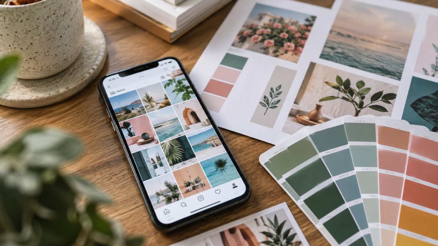
On Instagram, bright blues and teals get the highest engagement overall. Coral and warm tones perform particularly well for lifestyle content specifically. High contrast colors pop noticeably against Instagram’s white interface. Pastels tend to work well for aesthetic focused accounts built around a softer visual identity.
On TikTok, bold, saturated colors grab attention in the fast scrolling feed specifically. Neon colors perform well for entertainment content. Red and orange create genuine urgency for calls to action. Black and white work well for dramatic, high contrast content that needs to stand apart visually.
On LinkedIn, blue genuinely dominates the platform and performs well there specifically. Professional tones, navy, charcoal, and muted blues, tend to work best. White space signals professionalism throughout. Avoid overly bright or saturated colors, which tend to read as less credible in a professional context.
On Facebook, blue is the platform’s own native color and performs well as a result. Warm tones, red and orange, drive engagement on individual posts specifically. Green performs particularly well for health and wellness content. High contrast images consistently get more shares than muted ones.
Why the same colour performs differently by platform
It is tempting to assume a color that performs well on one platform will automatically perform well everywhere, but the surrounding interface changes everything about how that color actually reads. A bright blue that pops against Instagram’s white background can blend in and disappear entirely against Facebook’s own blue heavy interface, essentially camouflaging your content rather than helping it stand out. Testing a palette against each specific platform’s actual interface, rather than assuming universal performance, tends to catch this kind of mismatch before it quietly costs engagement.
What Different Colours Communicate in Social Media Posts
Every color genuinely sends a specific signal. Here is what each one communicates.
Red communicates urgency, passion, excitement, and energy. Use it for sales, limited time offers, and genuinely bold statements that need to feel immediate.
Blue communicates trust, reliability, calm, and professionalism. Use it for corporate content, healthcare, and finance specifically, where credibility matters more than excitement.
Green communicates health, growth, nature, and freshness. Use it for wellness, sustainability, and eco friendly brands built around those same values.
Yellow communicates optimism, warmth, happiness, and attention. Use it for uplifting content and specifically to grab attention in a crowded feed.
Orange communicates enthusiasm, creativity, adventure, and fun. Use it for calls to action and genuinely youthful brands aiming for an energetic tone.
Purple communicates luxury, wisdom, creativity, and mystery. Use it for premium products and creative industries specifically.
Pink communicates femininity, romance, compassion, and playfulness. Use it for beauty, fashion, and lifestyle content built around those associations.
Black communicates sophistication, elegance, power, and mystery. Use it for luxury brands and genuinely dramatic content that needs weight.
White communicates simplicity, cleanliness, purity, and space. Use it for minimalist brands and specifically to create breathing room around other elements.
How to Choose Brand Colours for Instagram, LinkedIn, TikTok & Facebook
Different platforms genuinely require different color approaches rather than one universal palette applied everywhere.
For Instagram, choose two to three primary colors that stand out clearly against the white interface. Bright, saturated colors tend to perform best. Your palette should look genuinely cohesive across a full grid layout, not just in individual posts.
For TikTok, choose bold, attention grabbing colors specifically. The fast scrolling feed demands high contrast to even register. Neon and saturated colors tend to work particularly well here.
For LinkedIn, choose professional, muted colors instead. Navy, charcoal, and muted blues signal genuine credibility. Avoid overly bright colors, which tend to undercut that professional read.
For Facebook, choose colors that complement the platform’s own blue interface. Warm tones, red and orange specifically, tend to stand out clearly against that blue background.
Canva
Canva offers template based design with genuine brand kit support built in. You can lock in your exact colors, fonts, and logo once, and every new design pulls from that same kit automatically going forward.
What stood out during testing was how consistently the brand kit carried across different content types, keeping a carousel, a Story, and a single post all visually aligned without manually reapplying colors each time.
Adobe Express
Adobe Express provides polished graphics with a professional finish. The templates lean toward a more refined, business-appropriate look compared to some lighter competitors.
The colour palette suggestions stood out during testing, offering complementary tones based on a single uploaded brand colour rather than requiring the full palette to be manually built from scratch.
Social by InstantDM
This tool offers AI-generated visual content ideas across platforms, keeping suggestions aligned with a brand’s existing palette rather than defaulting to generic, platform-standard colours.
What stood out during testing was how the AI adjusted color suggestions per platform automatically, leaning toward higher contrast options for TikTok and more muted, professional tones for LinkedIn from the same underlying brand palette.
Colour Psychology for CTAs, Ads & Promotional Graphics
CTA buttons are genuinely where colour psychology matters most of all. Here is the data worth knowing.
Red CTAs outperform other colours specifically for urgency. Buy now buttons in red convert roughly twenty-one per cent more than the equivalent green button.
Orange CTAs perform well for non-urgent actions specifically. Learn more and sign up buttons in orange tend to get genuinely high click-through rates.
Blue CTAs work well for trust-based actions. Download and get started buttons in blue signal reliability more effectively than warmer colours would.
Green CTAs work well for positive actions specifically. Join and subscribe buttons in green signal growth and general positivity.
The key here is matching your CTA color to the actual emotion you want to evoke. Urgency calls for red. Trust calls for blue. Growth calls for green. Fun calls for orange.
For ads specifically, high contrast colors grab attention most reliably. Your ad genuinely needs to pop against the platform’s own interface. On Instagram’s white background, bright colors win out. On Facebook’s blue interface, warm colors win instead.
Testing CTA colors without guessing
Rather than picking a CTA color based purely on the general psychology above, running a small, deliberate A/B test on your own audience tends to produce more reliable results than applying general data blindly. Swapping only the button color while keeping every other element identical isolates the variable cleanly, and running the test across at least a couple hundred clicks tends to give a genuinely reliable read rather than a result skewed by a small, unrepresentative sample.
How Warm vs Cool Colors Perform on Social Media
Warm and cool colors evoke genuinely different emotions and perform differently as a result.
Warm colors, red, orange, and yellow, create urgency and excitement. They grab attention quickly and work well specifically for CTAs and promotions. They tend to perform particularly well on light backgrounds. They suit sales, events, and announcements best.
Cool colors, blue, green, and purple, create calm and trust instead. They build long term brand perception more effectively than warm tones. They tend to work well for educational content specifically, and perform particularly well against dark backgrounds. They suit brand building and thought leadership content best.
The underlying data shows that warm colors get more immediate engagement, while cool colors build more long term trust over repeated exposure. The strongest overall strategy uses both deliberately, warm for attention grabbing content and cool for trust building content, rather than committing entirely to one or the other.
Building both warm and cool moments into one content calendar
Rather than treating warm and cool colors as a binary choice for the whole brand, the strongest approach layers both into a single content calendar depending on the goal of each specific post. A launch announcement or limited time offer earns a warm palette, while an educational post or a brand story earns a cool one. Planning this deliberately, post by post, rather than defaulting to whichever palette feels most natural that day, tends to produce a feed that performs well across both immediate engagement and longer term trust.

How Color Choices Influence Trust, Attention & Buying Decisions
Color genuinely affects every single stage of the buying journey, not just the initial glance.
At the attention stage, bright, high contrast colors grab attention directly in the feed. Your content genuinely needs to pop against whatever competitors are posting alongside it.
At the interest stage, colors that match your audience’s expectations create genuine interest. A healthcare brand using blue feels trustworthy as a result. A fitness brand using red feels energetic in a way that fits the category.
At the desire stage, colors that evoke the right emotions create real desire. Luxury brands using black and gold signal premium quality almost instantly, without needing to state it directly.
At the action stage, CTA colors that create urgency drive real action. Red buy now buttons convert better than nearly any other color tested consistently.
A tool such as Social by InstantDM helps create color consistent content across platforms throughout this entire journey. The AI generates visual content ideas that align with your brand palette while still driving genuine engagement at each stage.
How do different colors influence viewer emotions on platforms like Facebook and TikTok?
Blue signals trust on both platforms consistently. Red creates urgency wherever it appears. Warm tones, orange and yellow specifically, grab attention in fast scrolling feeds particularly well. Cool tones, blue and green, build longer term brand perception more effectively across repeated views.
Best Color Combinations for Social Media Content
Color combinations matter just as much as individual colors chosen in isolation. Here are combinations proven to work well together.
Complementary colors sit directly opposite each other on the color wheel, such as blue and orange, or red and green. These create genuine high contrast and grab attention effectively.
Analogous colors sit next to each other on the color wheel, such as blue and teal, or red and orange. These create harmony and a genuine sense of cohesion.
Monochromatic palettes use different shades of the same color, such as light blue paired with dark blue. These create sophistication and a strong sense of unity.
Triadic palettes use three colors spaced evenly around the color wheel, such as red, yellow, and blue together. These create vibrant, genuinely balanced compositions.
The strongest combinations for social media specifically tend to be blue and orange for trust paired with urgency, black and gold for luxury paired with premium positioning, white with a bright accent for clean design paired with attention grabbing contrast, and navy with coral for a professional feel paired with genuine energy.

Common Color Psychology Mistakes Brands Make
These mistakes quietly kill engagement more often than most brands realize.
Mistake 1: using too many colors. More than three to four colors creates genuine visual chaos. Stick to a deliberately limited palette instead.
Mistake 2: ignoring platform context. Colors that work well on Instagram may not work nearly as well on LinkedIn. Adapt your palette for each platform rather than reusing one set everywhere.
Mistake 3: following trends over brand identity. Trendy colors fade fairly quickly. Brand colors should stay genuinely timeless rather than chasing whatever is popular that season.
Mistake 4: ignoring accessibility. Color blind users genuinely cannot distinguish certain color combinations. Use contrast and labels together to ensure real accessibility.
Mistake 5: inconsistent colors across platforms. Your brand colors should stay consistent everywhere you post. Inconsistency genuinely confuses your audience over time.
Mistake 6: using colors that clash with your message. A funeral home should not use bright yellow. A children’s brand should not use dark gray. Match your colors to your actual message rather than picking arbitrarily.
How to audit your last month of posts for color consistency
A useful exercise here is pulling up a full month of your own posts side by side, ideally as thumbnails in a single grid, and checking honestly whether they actually look like they belong to the same brand. It is common to discover a color that crept in inconsistently, maybe a background that shifted from post to post, or a CTA button that changed color without a clear reason. Catching this kind of drift early tends to be far easier than trying to fix months of inconsistent visual identity all at once later.

How to Build a Consistent Social Media Colour Palette for Your Brand
Building a genuine color palette requires real strategy rather than picking colours that simply look nice in isolation.
Step 1: choose one to two primary colors. These are your brand’s main colours, and they should genuinely represent your brand’s personality and values.
Step 2: choose one to two secondary colors. These complement your primary colors directly. Use them for accents and general variety across content.
Step 3: choose one accent color specifically. This becomes your CTA color. Use it for buttons, highlights, and calls to action consistently.
Step 4: create real guidelines. Document your color palette with exact hex codes attached. Share this documentation with your entire team.
Step 5: apply it consistently. Use your colors in every single piece of content you produce. Consistency is genuinely what builds recognition over time.
A tool such as Social by InstantDM helps maintain color consistency across platforms throughout this process. The AI generates content ideas that align with your brand palette, while the scheduling helps ensure a consistent visual identity over time.
How has the concept of color love influenced marketing campaigns on social media?
Color love, the emotional attachment people form with specific colors, genuinely drives brand loyalty over time. Brands that own a color outright, Tiffany blue or Coca Cola red as clear examples, create instant recognition the moment that color appears. On social media specifically, consistent color use builds this same emotional connection gradually, post after post, until the color itself becomes shorthand for the brand.
The Bottom Line
Colour psychology is one of the most genuinely powerful tools in social media marketing in 2026. Every colour communicates a specific emotion, whether you plan for it or not. The right colours grab attention, build trust, and drive real conversions.
In 2026, colour alone drives eighty-eight per cent of initial brand judgements. Your content’s colours are genuinely the first thing people notice, well before they read a single word. The right palette makes your brand memorable. The wrong palette simply gets scrolled past.
A tool like Social by InstantDM helps you create colour-consistent social media content across platforms. The AI generates visual content ideas that align with your brand palette and your audience’s actual preferences.
Start thinking about your colour today. Please review your current content honestly. Identify your actual brand colours. Apply them consistently going forward. Watch your engagement shift. That’s how colour psychology works in practice.