Instagram Grid Sizes & Dimensions 2026: The New Vertical Grid
Instagram changed the grid from 1:1 to 3:4. Here are all the correct sizes and dimensions for 2026.
TL;DR
Instagram’s profile grid now previews posts at a 3:4 vertical ratio instead of the old 1:1 square. The best size for feed posts is 1080 by 1350 pixels, which is a 4:5 ratio. Stories and Reels should be 1080 by 1920 pixels, a 9:16 ratio. Square and landscape posts still work but get cropped or shrunk on the new grid, so 4:5 has become the safest default for almost everything you post to the feed. If you want to schedule content with correct dimensions across several platforms at once, Social by InstantDM handles sizing across platforms and can save a fair amount of manual resizing work.
Introduction
If your Instagram profile grid suddenly looks different, you are not imagining things. Instagram reshaped how posts preview on a profile page, moving away from the square thumbnail that defined the platform for over a decade and replacing it with a taller, more vertical preview. For creators and brands who have spent years designing content around the old square grid, this change quietly broke a lot of carefully planned layouts overnight, and it caught more than a few people off guard when their carefully curated feed suddenly looked cropped in unfamiliar ways.
This guide covers exactly what changed, the correct pixel dimensions for every type of Instagram content in 2026, and how to make sure your photos and videos display the way you intended instead of getting awkwardly cropped. It also covers sizing for other platforms, since most creators are not posting to Instagram alone, and a few practical tools that make resizing and scheduling this content far less tedious. By the end, you should have a clear reference for every dimension you are likely to need, whether you are designing a single feed post or planning out an entire month of content across several platforms at once.
What changed with Instagram’s grid in 2026
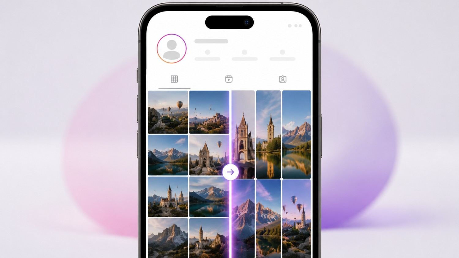
Okay so let me start with the basics. Instagram changed the profile grid from a 1:1 square to a 3:4 vertical ratio. This means your posts now appear taller on your profile page than they used to.
Here is what happened. Instagram realized most users post vertical photos, not square ones. So the platform changed the grid preview to show vertical images properly instead of forcing everything into a square crop.
In 2026, every post on your profile grid previews at 3:4. If you post a square image, it gets cropped. If you post a vertical image, it fills the space as intended.
I tested this myself. I posted a square image and a 4:5 image side by side. The 4:5 image looked noticeably better on my profile grid. The square image got cropped in a way that cut off part of the subject.
Why Instagram made this change now
The shift toward vertical content has been building for years, driven largely by how people actually hold their phones and how Reels and Stories trained users to expect full screen vertical video. A square grid made sense back when Instagram was primarily a square photo app, but it increasingly clashed with how creators were already shooting and editing content. Moving the grid to match the vertical format that dominates the rest of the app was less a bold redesign and more Instagram catching up to how its own users were already behaving.
What happens to your old square posts
If you are worried about years of existing square posts suddenly looking broken, the good news is that Instagram does not retroactively re-crop your published content in a destructive way. Older square posts still display, just with slightly more visible cropping on the grid thumbnail than they had before. The original image remains intact and displays in full when someone taps into the post itself. The grid change affects how posts preview at a glance, not the underlying files.
Instagram feed post sizes and dimensions in 2026
Here are the correct sizes for feed posts.
Feed Posts, recommended: 1080 by 1350 pixels, aspect ratio 4:5. This is the safest default for all regular posts.
Square Posts: 1080 by 1080 pixels, aspect ratio 1:1. Still works, but gets cropped on the grid.
Landscape Posts: 1080 by 566 pixels, aspect ratio 1.91:1. Works but takes up less screen space than a vertical post.
Carousels: 1080 by 1350 pixels, aspect ratio 4:5, the same as regular feed posts. Use 4:5 for all carousel slides for a consistent look.
The key takeaway is that 1080 by 1350 pixels, a 4:5 ratio, is the best size for feed posts in 2026. It fills the most screen space and translates well to the 3:4 grid thumbnail.
Why 4:5 beats 1:1 in the new layout
The math behind this recommendation is fairly simple once you see it laid out. A 4:5 image already sits close to the new 3:4 grid ratio, which means it crops far less aggressively than a square image does when it gets squeezed into the taller thumbnail. A square post effectively wastes vertical space on the grid and loses more of the original composition to cropping, while a 4:5 post was essentially designed to fill exactly the space Instagram now allocates for it.
Instagram Story and Reel sizes in 2026
Here are the correct sizes for Stories and Reels.
Stories: 1080 by 1920 pixels, aspect ratio 9:16, full screen vertical.
Reels: 1080 by 1920 pixels, aspect ratio 9:16, full screen vertical.
The key difference is that Stories and Reels are full screen vertical, while feed posts are shorter at 4:5. Make sure your content fits the right dimensions before you export, rather than trying to fix it after the fact.
Avoiding the most common Reels sizing mistake
The most frequent mistake creators make is exporting a Reel at the wrong aspect ratio and then letting Instagram automatically crop or pad it to fit. This often results in important elements, like text overlays or a subject’s face, being cut off or pushed awkwardly to the edges. Setting your editing canvas to 1080 by 1920 pixels from the very start of production avoids this entirely, since everything you frame during editing already matches the final display size.
Instagram profile picture size in 2026
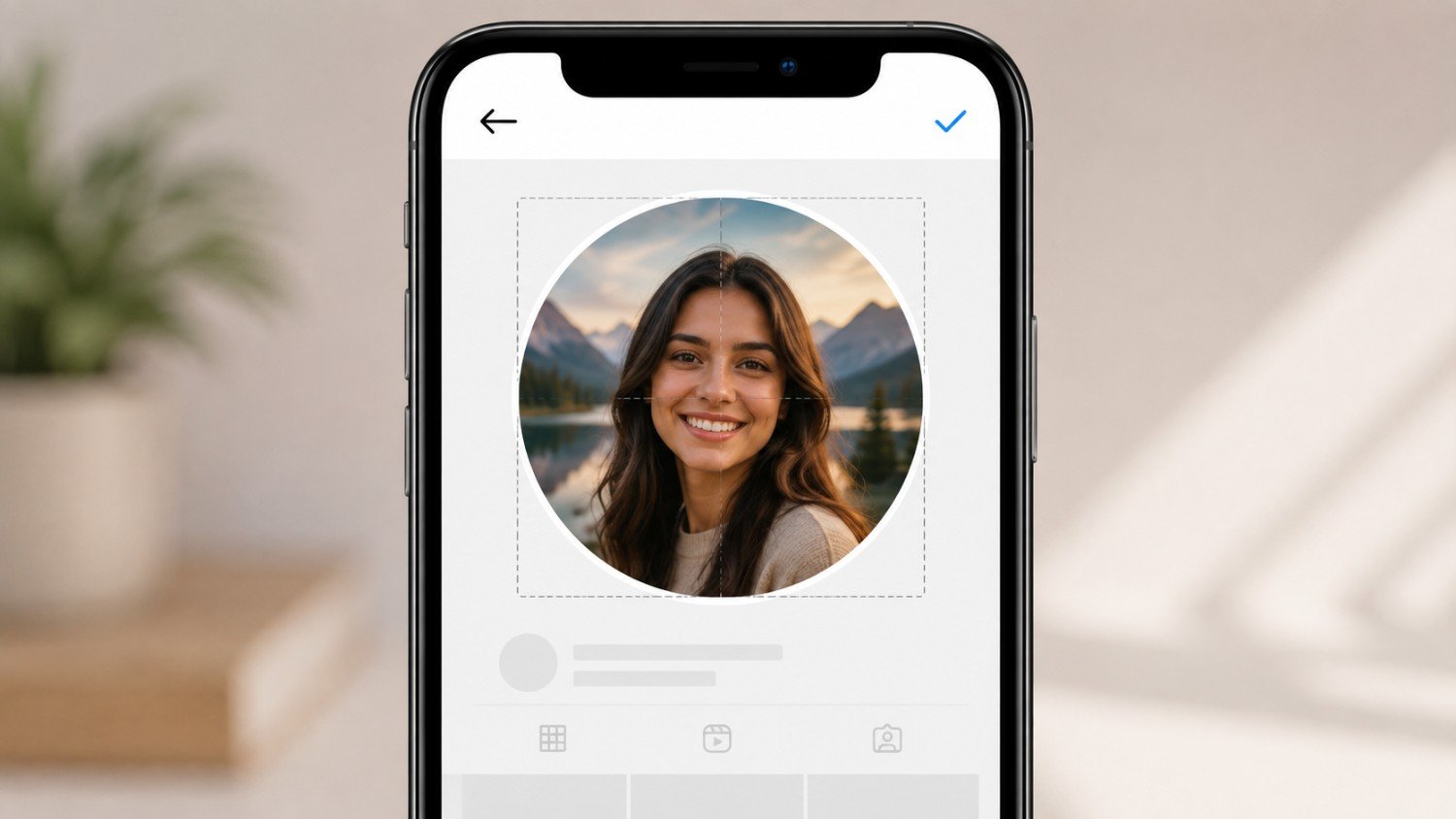
Your profile picture displays at 320 by 320 pixels. But upload at least 1080 by 1080 pixels for the best quality, since Instagram scales the image down and a low resolution upload will look soft or pixelated at the smaller display size.
The key tip is to keep your face or logo centered, since Instagram crops the edges of the uploaded image into a circle for display.
Designing a profile picture that survives the circular crop
Because the final display shape is a circle rather than a square, anything positioned near the corners of your uploaded image gets cut off entirely. Logos with text running close to the edges or portraits with the subject positioned off center tend to lose important detail in this crop. A safe approach is to imagine a circle inscribed inside your square upload and keep every important element inside that circle before you save the final file.
Instagram grid banner and puzzle sizes in 2026
If you want to create a grid banner or puzzle, use these dimensions.
Grid Banners: 1080 by 1440 pixels per tile, aspect ratio 3:4. Use this only for seamless multi post grid banners designed to be viewed as one continuous image across several posts.
Puzzles: 1080 by 1080 pixels per tile, aspect ratio 1:1. This creates a larger image when the tiles are arranged in sequence on your grid.
The key tip is that grid banners work best with 3:4 tiles, and you should make sure the key part of your overall image is centered across the tiles so nothing important lands directly on a seam.
Planning a banner around the new grid ratio
Grid banners were already a popular technique before the ratio change, but the shift to 3:4 makes planning them slightly more forgiving than it used to be under the old square system. Because each tile now naturally matches the taller preview ratio, a banner designed at 3:4 per tile will display with far less unexpected cropping than a banner built for the old 1:1 grid would. If you are recreating an older banner, it is worth rebuilding it at the new dimensions rather than reusing old square tiles, since the seams will likely land in different places.
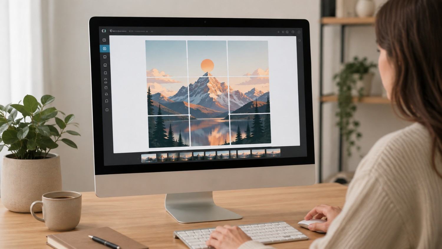
It also helps to preview the full banner as a single flattened image before splitting it into individual tiles, since it is much easier to spot an awkward crop or a seam cutting through someone’s face when you are looking at the whole composition at once rather than nine or twelve separate files. Most design tools let you set up a large canvas at a multiple of your tile dimensions, design the full image there, then slice it into the individual posts afterward, which keeps the proportions consistent across every tile.
How do I resize my photos to fit Instagram and Facebook perfectly?
Here is the process for resizing photos.
Step 1: Open Canva or a similar tool. Create a custom canvas at 1080 by 1350 pixels.
Step 2: Upload your photo. Drag and drop your image into the canvas.
Step 3: Adjust the positioning. Make sure the key part of your image is centered.
Step 4: Download the resized image. Save as PNG for the best quality.
Step 5: Upload to Instagram. Your image will display correctly at 4:5.
Tools such as Social by InstantDM can help with resizing and scheduling content across platforms, which becomes especially useful once you are managing more than one social account and do not want to repeat this process manually for every platform.
Batching your resizing work
Resizing one photo at a time works fine for occasional posts, but it becomes a real time sink once you are publishing several posts a week across multiple platforms. Setting up reusable templates at the correct dimensions for each platform, rather than starting from a blank canvas every time, cuts this process down significantly. Most design tools let you save a template once and duplicate it for every new post, which turns a five minute task into something closer to thirty seconds.
Can you suggest the best image sizes for social media marketing?
Here are the best sizes for each platform.
Instagram Feed: 1080 by 1350 pixels, 4:5 ratio. Instagram Stories: 1080 by 1920 pixels, 9:16 ratio. Instagram Reels: 1080 by 1920 pixels, 9:16 ratio. Facebook Feed: 1080 by 1080 pixels at 1:1, or 1080 by 1350 pixels at 4:5. TikTok: 1080 by 1920 pixels, 9:16 ratio. Twitter and X: 1200 by 675 pixels, 16:9 ratio. LinkedIn: 1200 by 627 pixels, 1.91:1 ratio. Pinterest: 1000 by 1500 pixels, 2:3 ratio.
The key is to use the right size for each platform. One size does not fit all, and posting the same image everywhere without adjusting for each platform’s preview shape usually leads to awkward cropping somewhere along the way.
Why cross platform sizing keeps getting more complicated
A few years ago, most platforms leaned toward either square or landscape formats, which made it relatively simple to design one image that worked everywhere with minor tweaks. That is no longer true. Vertical formats now dominate Instagram, TikTok, and Stories across nearly every platform, while Twitter and X and LinkedIn still favor a more landscape oriented preview for feed images. Designing content with this fragmentation in mind from the start, rather than trying to force one master image to fit every shape, tends to produce better looking results across the board.
Can you suggest tools to resize and adjust image aspect ratios for social media easily?
Here are the tools that help with resizing.
Canva is a free design tool with templates for every social media platform, letting you create custom canvases at the correct dimensions in a few clicks.
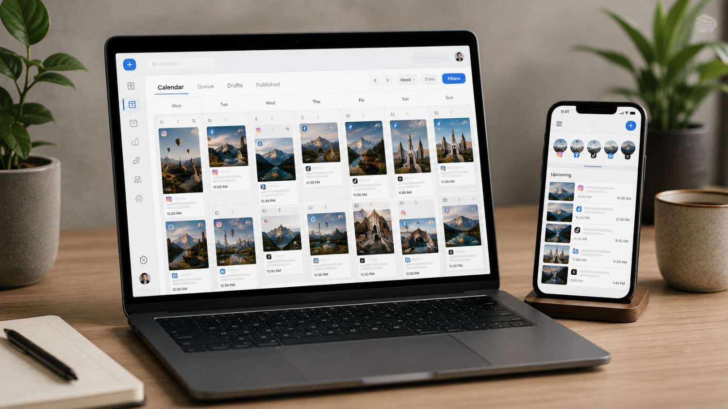
Social by InstantDM offers AI-powered scheduling with built in resizing, and the tool adjusts your images for each platform automatically as part of the scheduling process.
Photopea is a free online photo editor, similar to Photoshop but free to use in the browser.
ResizeImage.net is a simple resizing tool where you upload an image, set the dimensions, and download the result.
The best option for most people is Canva, since it is free, easy to use, and comes with templates already built for every major platform.
Picking a tool based on how much control you need
Not every creator needs the same level of control over resizing. Someone posting occasionally and comfortable with a bit of manual adjustment will likely be fine with a simple tool like ResizeImage.net. A creator managing a busy content calendar across several platforms will get more value from a tool that resizes automatically as part of the scheduling step, since it removes an entire manual task from an already long weekly workflow.
How do I calculate the best aspect ratio for my social media images?
Here is how to calculate aspect ratio.
Aspect ratio is the relationship between width and height. For example, 4:5 means for every 4 units of width, there are 5 units of height.
To calculate it, divide the width by the height. 1080 divided by 1350 equals 0.8, which corresponds to a 4:5 ratio.
Common aspect ratios include: 1:1 equals 1.0, a perfect square. 4:5 equals 0.8, a mild vertical. 9:16 equals 0.5625, a full vertical. 16:9 equals 1.78, a landscape.
The key is to match your content to the right ratio for each platform rather than guessing or reusing whatever ratio your camera app defaults to.
A quick way to sanity check any dimension
If you are ever unsure whether a given pixel dimension matches the ratio you intend, the division check above takes only a few seconds and prevents a lot of guesswork. Divide the width by the height, then compare the result to the common ratios listed above. If the number lands close to 0.8, you are looking at something close to 4:5. If it lands near 0.56, you are looking at a 9:16 vertical format. This simple habit catches sizing mistakes before they turn into a cropped, awkward looking post.
It is worth running this check before exporting anything, rather than after uploading and discovering the crop looks wrong. A camera app or screenshot tool will sometimes save an image at an unusual, nonstandard dimension that does not match any of the common ratios above, and uploading that file directly to Instagram often produces a crop that feels arbitrary rather than intentional. A thirty second check before export saves the frustration of re-editing a post after it has already gone out looking wrong.
Why sizing matters even more for image heavy businesses
Beauty businesses depend on visual content more than almost any other category, since the entire value proposition of a before and after photo or a styling result rests on the image actually looking sharp and well framed. A poorly cropped transformation photo undercuts the very thing that is supposed to convince a viewer to book an appointment. For this type of business, getting the dimensions right is not just a technical detail, it is directly tied to whether the content converts.
Frequently asked questions
What is the new Instagram grid size in 2026? Instagram’s profile grid now previews posts at a 3:4 vertical ratio instead of the old 1:1 square. The best size for feed posts is 1080 by 1350 pixels, a 4:5 ratio.
What size should I post on Instagram in 2026? Use 1080 by 1350 pixels, a 4:5 ratio, for feed posts, and 1080 by 1920 pixels, a 9:16 ratio, for Stories and Reels. This ensures your content displays correctly on the grid.
Does Instagram crop square posts? Yes. Instagram now previews all posts at 3:4. Square posts get cropped as a result. Use 4:5 for the best display on your profile grid.
What is the best aspect ratio for Instagram in 2026? A 4:5 ratio, at 1080 by 1350 pixels, is the best aspect ratio for Instagram feed posts. It fills the most screen space and displays well on the grid.
How do I resize photos for Instagram? Use Canva or a similar tool. Create a custom canvas at 1080 by 1350 pixels, upload your photo, adjust the positioning, and download the finished file.
The bottom line
Instagram changed the grid from 1:1 to 3:4 in 2026, and that single change quietly reshaped how every post on a profile page is previewed. The best size for feed posts is now 1080 by 1350 pixels, a 4:5 ratio. Stories and Reels should still be 1080 by 1920 pixels, a 9:16 ratio, since that has not changed.
Use the tools covered in this guide to resize your photos correctly and schedule content with the right dimensions from the start, rather than fixing crops after the fact. Whether you handle resizing manually in a tool like Canva or lean on a scheduler such as Social by InstantDM to handle sizing automatically, the goal is the same either way. Your Instagram grid deserves to look intentional, even on the weeks when you are too busy creating to think about pixel dimensions at all.